Fintech Hackathon and Global FX
posted on March 27, 2013I was part of a fun little excursion into the world of fintech (née “financial technology”) this weekend. At the FinTech hackathon in New York, Ben Gundersen, an extemely talented guy and a wizard with JS, and I wrote a simple visualization tool we call “GlobalFX”. The idea was to create an interesting and somewhat useful way to view foreign exchange rates over time.
First, a quick shout out to some awesome companies who helped us out. Some wonderful people (thanks, Francesca and Matt!) at 10Gen got us in touch with the MongoHQ folks who, at 11PM EST on a Saturday, spun up a 20GB MongoDB instance for us. Right before that, Tammer at Quandle basically gave us unlimited API calls. We also used Oanda (who have incredibly fast data serving ability), and intend to integrate them even more fully with the application in the coming days.
The Problem & Solution
We came into the event knowing that we wanted to make a novel, useful visualization. In retrospect, that’s a rather tall order. I think we ended up doing that, but I’ll leave that judgement to you, gentle reader.
The problem? Visualization the value of currencies relative to each other, over time. ForEx traders have very few comparative visual analysis tools, making EDA rather difficult. As someone who is interested in data as a medium for driving discovery, EDA is very important to me.
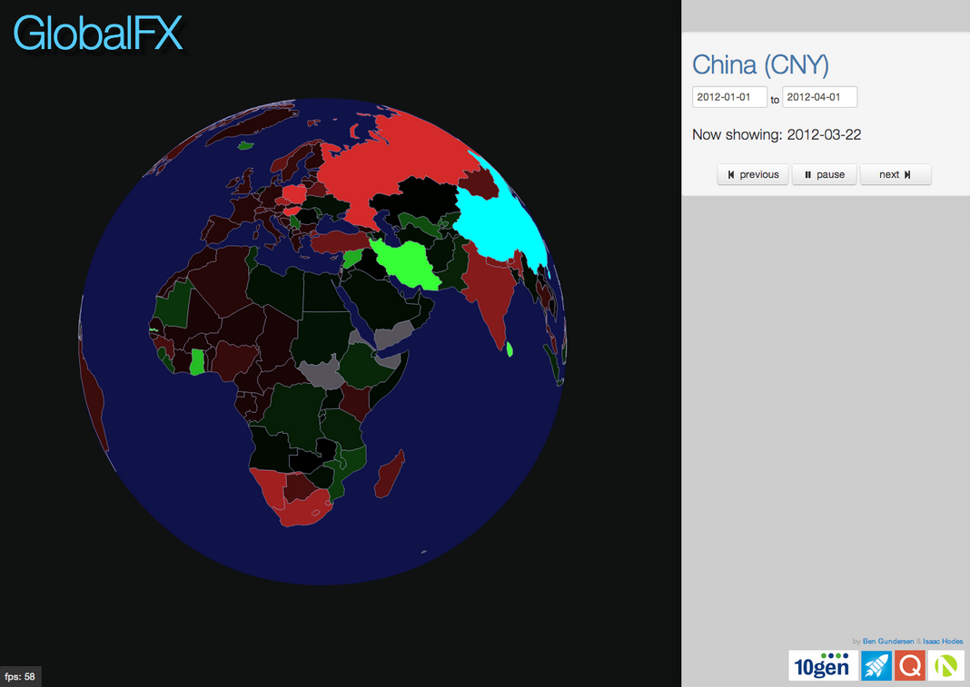
We chose to make a dynamic global chloropleth map of the value of currencies relative to a selected country, over time. That’s quite a mouthful, so here’s a screenshot to show you what that might look like.

Here, China is selected. To the north, where it is a very vibrant red, you can see that Russia is doing particularly poorly. This indicates that Russia’s ruble has declined in value relative to the China renminbi from the start date of the data (here set to 2012-01-1) to the current date of the animation (2012-03-30). Conversely, Iran’s (bright green) currency has done quite well.
Oh yeah. That’s right: it’s an animation. The values change before your eyes, as the globe rotates slowly (or you drag it, zoom in on it, or keep it in place by hovering over it). You can check it out here, though I don’t know how much longer our Mongo instances will be running (and thus, how much longer this will work).
The Technology
Our backend is an extraordinarly simple Python application using Flask to serve our content and run an api for returning data from our MongoHQ DB (their RESTful interface wasn’t working for us, but that was probably a result of our brains failing/it being 6AM when we tried to use it). The rest of our data came directly from Oanda, and we just pulled that in with AJAX, as it was in the right format for us right away. The much more interesting frontend is a JavaScript application using the usual suspects (JQuery, Underscore, and Bootstrap), and the magical, wonderful d3.js to map our GeoJSON and make visualizing the data the way we do possible in fewer than 24 hours.
The data processing came in the form of transforming a ton of CSVs from Quandl into a few GB of documents we could quickly serve from Mongo. We used pandas to make a few throw-away scripts handling the ETL of our data. It wasn’t the most interesting thing, but it made our app useable and fast. I was a bit jealous of the magic happening on Ben’s monitor, though…
Overall, we had a lot of fun. We didn’t win the whole thing, but we got a nice prize from Oanda, and met a lot of great people both working on projects and from the sponsor companies. Thanks to all the sponsors and organizers who put on this great event, especially Nick for making it happen, and Novus for sponsoring a lot of it and being such great people in general. We all had a great time: I know I’ll be there next year.